Composition in photography is the key essence of a good photograph. I hope you click many memorable moments through your camera or mobile phone. If that particular device is near to you, please open your recent picture folder. Now, do not judge like a pro of your own click and swipe the pictures. I am sure if your swiping speed is 2 seconds each for your photograph, you must stand little bit more for a specific click.
Ask yourself why you stand or spend more time for that particular picture? Do you get any speciality in it? Yes, of course, you get some special flavor on that picture than the other photographs. That is the composition in photography.
Composition in photography world is all about the correlation between object and elements. It creates an eye soothing, visual art and aesthetic value. In other words, photographic composition makes a balance between object and elements in an image.
Photography composition – hard or easy?
I think those who love photography are art lovers and dormant artist. A photographer sketches their canvas with light and camera. The main difference between a painter and a photographer is time and putting elements in a systematic manner. A painter can visualize and develop his/her ideas on the canvas based on various elements. The elements like color, shape, texture, lines are created and depicted by the painter. A photographer hardly gets more than a second to store an image in camera (street, stage or concert photography). the studio photographs may get much more time to assemble elements and object in a perfect manner but when he/she clicks, it is generally a fraction of second and cannot modify the composition on that time. Painters’ gets an advantage to develop a painting and change the elements time to time.
If you practice with the following elements and keep in mind when photograph a subject your every picture tells a story. It will be an eye soothing and able to interact with the viewers.
Simplicity – composition in photography
The main objective of a photograph is to tell a story. A message should pass on to the viewers. The subject and various elements in a composition tell the story. If your composition is jumbled up or distracts the eyes of viewers on various elements; the composition fails to portray the precise message to the viewers. Therefore, eliminating additional elements in a composition creates a more striking image with a lot of viewers’ attention.

In composition, simplicity is based on the background of the subject, color, texture, space, and lighting position. A busy background, improper color orientation, inappropriate light position and condition often failed to give the right message to the viewers. In my opinion, maximum famous photographs are based on simplicity which helps the viewers to read the message of the photograph properly.
Rule of third
If you segregate your composition with two vertical and two horizontal lines with equal space and place your composition elements at the junction point of the lines. It helps the viewers to focus on that subject or element first. To know more about this composition rule, please click here– > Basics of Photography – I – Clickstory
Lines
It helps the viewers to read the photograph from a specific area to another part. The lines drag the attention to the main area of the composition. To know more about lines, please click here — > Line: most important photography element.
Color

The natural and artificial colors in a composition pass a strong message to every photograph. Every color has a specific meaning. To know more about color in composition, please click here — > color
Texture
It refers to the look of how something is perceived to feel and sends the perfect message to the viewers’ minds. To know more about texture, please click here — > Texture
Symmetry
In our subconscious mind, symmetry makes us comfortable and feels at ease. Mainly the system can be observed in nature like a mountain peak, a bunch of trees, etc. which means some portions on both sides. A center image may grab our attention more because it formed a symmetry position all over the frame.
Balance
It is one of the most important compositional elements in photography. it is all about the visual weight in a picture. It is the similar levels of visual weight between the left and right halves. If you want to pass on a specific message, gain the visual weight of either half. The strong attention points are eyes, faces, colorful areas, bright and sharp areas, and so on.

The signature in a digital image also carries the balance in a photography composition, hence, when you embed your signature in your own click, map the photograph first and then put your signature in the specific area to maintain the perfect balance.
Space
There are two types of spaces available in the photography composition. The positive space is the attraction area of the composition which tells you the story. The negative space is the empty areas. Both create a strong message and emotion in the composition.

The negative space creates an impact of dynamic or movement. It also creates relief in the composition. For example, in portrait or dance photography, the subject is the most attractive point, and it occupies positive space. The eyesight of the portrait shows that he/she stares to the right side, put a negative space for relief, and establishes a strong meaning of the portraiture or dancer’s movement. But maximum or minimum large space sends a wrong message to the viewers. You can break the conventional rule to create more tension and so on.
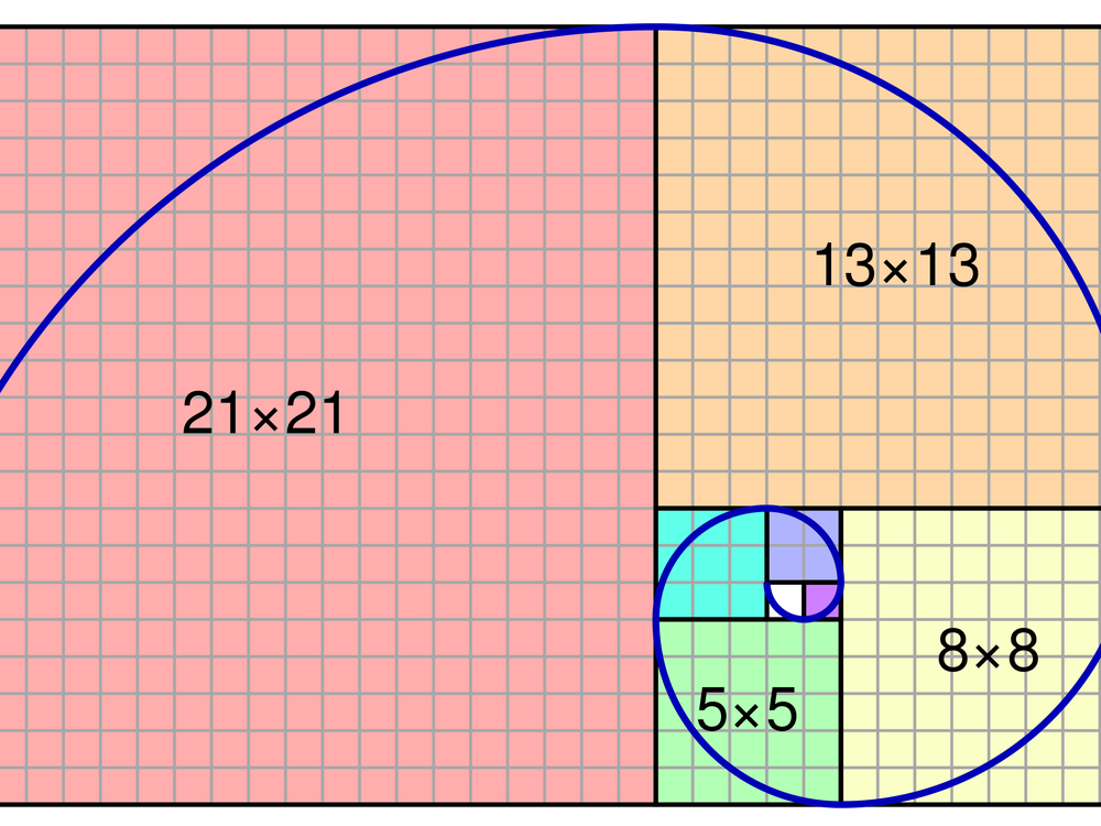
Golden spiral or ratio
The rule of third is the simplified version of the golden ratio. It is much easier for novice photographers to make a composition. The golden ratio method is used for a striking composition and balanced one. It is found everywhere in the nature and human body. Famous painters and architects used this method maximum the time in their paintings and architecture.
Euclid was the first to provide a written description in 350 B.C. The mathematics behind the golden ratio is simple. A line is divided into two halves a and b. the ratio of the larger section is a and the smaller section is b, and it is equal to the ratio of the whole length (a + b) to the larger section. Hence, the formula is a/b = (a + b)/a and outcome is an irrational number. It is also known as the golden number or phi. Phi is approximately equal to 1.618.
Idea behind the golden ratio
When we want to divide a line into two parts where the whole length is divided by the long part which is also equal to the long part divided by the short part.
For example: suppose a full-length line is 100 and we divide it 72 (a) and 28 (b). According to the formula of golden ratio [ a + b / a = a/b ] the outcome of both is different. (72+28) / 72 = 1.389 whereas 72/28 = 2.571. Now, we change the value of a = 61.8 and b = 38.2
Therefore, 61.8+38.2/61.8 = 1.618 and 61.8/38.2 = 1.618 and it is the most pleasing canvas shape for the artists. Various famous architectural, paintings and sculpture had been made with the above rectangle shape.
In 1202, Leonardo Fibonacci, a mathematician, gifted us a series of rational numbers which tend to phi. The numbers start from 0 and then 1. Now add the first number to the second one. It produces the third number. For example, 0 1 1 2 3 5 8 13 21 ….. and so on.

It is apparently like with the rule of the third but in close monitoring, you can find the middle portion is 0.618 whereas the other halves are 1. It derives the viewers’ attention to the most

In the golden ratio or phi grid, the subject is much closer to the center. In the golden spiral, put your main story or subject in the innermost circular pattern and the other elements will be placed in the pattern and other elements will be placed in the other spiral hands, I can conclude that the golden ratio helps the composition more dynamic and emphasize movement.
Geometric shapes
The natural shapes in your composition make it more vibrant, soothing, and dynamic.
S curve: it can be seen mainly in landscape photography and street photography. It is the developed version of leading lines. It helps the viewers to feel he/she is on the way and read the picture through the path.

Triangle: It emphasizes power, authority, strength, etc. a triangle creates depth and perspective in an image. The golden triangle is a modern geometric curve in photography. It divides the frames into four triangles.
The Golden Triangle in photography is actually not a curve (like the Golden Spiral). It is a composition rule based on straight lines and triangles.
What It Is
The Golden Triangle composition divides a rectangular frame using:
- One main diagonal line (corner to opposite corner).
- Two additional lines drawn from the remaining corners, meeting the main diagonal at right angles.
This creates four triangles inside the frame.
How It Works Visually
Imagine a rectangle:
- Draw a diagonal from top-left to bottom-right.
- From the top-right corner, draw a line to meet the diagonal at 90°.
- From the bottom-left corner, draw another line to meet the diagonal at 90°.
Now the frame is divided into four triangles of different sizes.


Why Photographers Use It
The Golden Triangle:
- Creates dynamic tension
- Works well with strong diagonal elements
- Adds movement and direction
- Is great for landscapes, architecture, and action shots
It is especially useful when your subject naturally forms a diagonal — like:
- A river flowing across the frame
- A road cutting through scenery
- A person leaning or moving diagonally
Circle: This shape is an all-rounder. It represents peace, faith, stability, and divinity. Circles in a composition interact with the viewers for harmony and dynamism.
Square: It represents a sense of oddity or solidity. The viewers may interact with this element in a composition for stability and permanence.
Repetition or the same pattern

I personally like to click dance concert moments, portraits, and street. The same pattern with 95-100% synchronization attracts the viewers’ attention more in dance concert photography. Landscape, portrait, and group photos can follow the repetitions.
Viewpoint
It has an intensive impact on the composition of photography. It is all about the various types of angles to click a picture. To know more about angle point of view, please click here — > various angles as point of view to improve photography.
Fill the frame
If you want to draw more attraction of the subject only then fill the frame and eliminate other elements from the frame. In some cases, it could be more interesting to read a photograph. It helps the viewers to find out the detail of the texture, expression, moments and so on.
Shallow depth of focus

If you want to focus only on the subject or if there is a busy background, use a wide aperture f/1.8 or zoom lens (telephoto). it will automatically blur the background and foreground. This technique is mainly used in portrait photography, toy photography and creative photography.
Frame
The nature’s various substances like tree, branch, flower, cave etc and architectural pattern helps you to shoot your subject with a ready made frame. It enhance the structure of the photograph and viewers’ can feel their presence at the time of reading the photograph.
Conclusion
Here I discuss a very few composition techniques. There are various composition rules available in photography books and on the internet. There is no hard and first rule available in photography. you can break the rule at any point in time. The main objective is to tell the viewers about your click’s message. As a footnote, do your own composition beyond the above rules of composition but learn and know the composition rules first then only break the rule of composition.


A very good information