Color is one of the most powerful storytelling tools in photography. While many photographers spend time learning about lenses, composition, or equipment, they often overlook the emotional influence of color. Color can make a photo feel warm or cold, happy or sad, energetic or calm—without the viewer even realizing what changed. When you understand how color works, you gain the ability to guide emotions and tell deeper stories with your images.

Warm vs Cool Tension
Warm and cool colors work like emotional signals inside a photograph. Warm colors such as red, orange, and yellow feel alive and active. They create a sense of excitement, joy, and closeness. For example, a portrait taken during golden hour with soft orange sunlight on the skin immediately looks warm, friendly, and emotional. A dancer under red stage lights appears powerful and full of energy.

Cool colors like blue, green, and purple have a completely different effect. They feel calm, peaceful, and sometimes mysterious. A mountain landscape covered in blue morning fog feels quiet and distant. A street photo taken under blue neon lights can feel lonely, futuristic, or thoughtful. Even in studio portraits, placing your subject near a cool-toned background creates a more relaxed or introspective mood.
When warm and cool colors meet in the same frame, they create visual tension that makes an image more dynamic. Imagine a model wearing an orange dress standing in front of a blue wall. The warm dress moves forward in the viewer’s mind, while the cool wall steps back, creating depth and drama. Landscape photographers often capture sunsets that mix warm orange skies with cool blue shadows, creating a cinematic tone that holds the viewer’s attention.
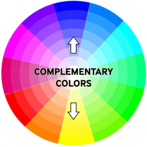
Complementary Color Contrast
Complementary colors sit opposite each other on the color wheel. When combined—like blue and orange, red and green, or yellow and purple—they create strong visual impact that instantly draws attention.
In portrait photography, one of the most common combinations is blue and orange. A person photographed outdoors in cool blue shade while their skin tones remain warm immediately stands out. This balance feels fresh and professional because the colors naturally support each other.

In landscape post, you might see bright yellow flowers under a deep purple sky during sunset. The contrast between the warm yellow and the cool purple makes the scene feel magical and rare. Wildlife photographers often use natural complementary colors without realizing it. A peacock or parrot with blue and yellow feathers becomes striking simply because the colors complement each other.
In everyday street scenes, complementary colors appear in shop signs, clothing, and light reflections. A person wearing a red jacket walking past a green storefront becomes the automatic focus of the frame because red and green vibrate visually when placed together. Even food and tabletop photography uses this idea—a bright orange soup served in a blue bowl immediately looks more appetizing and eye-catching.
Complementary colors don’t just make the photo attractive. They help separate the subject from the background and strengthen the story.
Split-Tone Storytelling
Split toning is an editing technique where you add one color to the highlights and another to the shadows. It doesn’t just change the look of an image—it changes the emotion.
When you add warm tones to the highlights and cool tones to the shadows, your image becomes dramatic and modern. Street photographers use this style often—yellow streetlights glowing in a scene with blue shadows give the photo a cinematic feel.
Landscape photographers also love this look. A warm sunrise touching the mountain peaks while the valleys remain in cool blue shadows adds depth and atmosphere.

The opposite approach, cool highlights with warm shadows, creates a dreamy and nostalgic feeling. Imagine a foggy landscape where the mist is tinted with light blue while the ground and trees carry warm earthy tones. This combination feels soft and emotional. In studio shoots, using one warm light on one side of the face and a cool light on the other creates a striking split-tone effect directly on the subject. It adds tension, personality, and depth to the portrait.
Even food photography benefits from split tones. Warm highlights on the food with cool shadows around the props make the dish look fresh yet inviting.
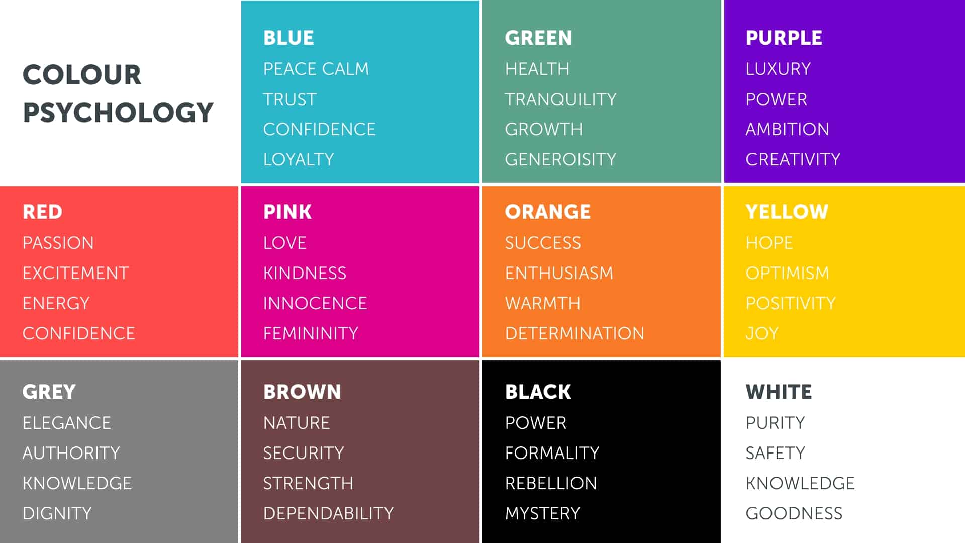
Cultural Associations of Color
Colors also carry deep cultural meanings. In India, these associations are especially strong and understanding them helps photographers tell stories with respect and authenticity.
Red is connected to love, marriage, and power. A bride wearing a red lehenga communicates emotion, tradition, and strength even before she moves. Yellow represents positivity, purity, and knowledge. During a Haldi ceremony, everything turns warm and cheerful, which makes the photographs feel naturally joyful.
White stands for peace and spirituality. A classical dancer performing in white attire under soft lighting appears graceful and pure. Blue often represents devotion. Dance performances inspired by Krishna frequently use blue lighting or costumes to reflect this meaning, allowing photographers to communicate emotion through color alone.

Wildlife and nature also carry cultural color symbolism. A tiger photographed in golden light looks majestic and royal, matching India’s cultural association of gold with honor and prestige.
Understanding cultural color meaning allows photographers to create deeper emotional connection and avoid accidental miscommunication.
Genre-Based Color Psychology in Action
Color psychology appears in every photography genre. In portrait photography, warm tones create friendliness while cool tones add thoughtfulness. In landscapes, warm sunsets feel comforting while blue mornings feel calm and distant. Street photography uses neon colors to create mood—blue feels lonely, while orange feels lively.
Wildlife photography uses nature’s own color palette. Warm morning light makes animals look majestic, while cool forest shadows make scenes mysterious. Tabletop photography uses warm tones to make food look inviting and cool tones to make drinks or salads look fresh. In studio photography, complete control over color allows you to create emotion, whether through colored backdrops, gels, or split lighting.
Each genre gains meaning and power when you use color with intention.
Conclusion
Color is far more than a decoration in a photograph—it is a language that speaks directly to the viewer’s emotions. By understanding warm and cool tones, complementary contrasts, split-toning, and cultural meanings, you can turn simple photos into powerful stories.


