Color is flowing on every part of the world. If we analyze color scientifically like a physicist, it is the wavelength of light. The wavelength in between 360nm to 700nm are only visible to human beings.

In photography, colors in a composition photograph convey emotions. It is one of the important elements along with line, shape, texture, size, etc. In photography.
In photographic art, color emphasizes the mood of a composition. It shouts the message in a composition. It establishes the balance, rhythm, contrast, and so on in a photograph.
Properties
There are three properties available in color. They are hue, saturation and value.

I) Hue: Generally, when we think about color, it is hue. It represents the color family. For example, red, green, blue, etc.
II) Saturation or intensity: It refers to the vibrancy of color. It describes the purity of color. Highly intense color is bright and saturated whereas the low intensity of the color is muted or dull. A high saturated color is not white, black, or grey. It is known as chromatic. If we add white in the full saturated color then it turns into fed which is also known as tint. Mixing black in hue turns a darker hue which is renamed shade. Gray with hue represents the tonality of color.
III) Value: It refers to how much dark or light hue is available in a photograph. It helps to identify the tonal scale of the hue. For example, a gray color tonal scale from white to black is identified.
Emotions and color
If we pass the light through a prism, VIBGYOR (violet, indigo, blue, green, yellow, orange, red) is detected on the opposite side. It elicits different emotions by convention. For example, red is for aggression and danger. Blue symbolizes calm. Yellow represents happiness. White conveys innocent, and peace. Black for mournful. Purple is used for wealth, confidence, etc.

The nature around us is colorful. We can observe the bright color as well as muted, dull and harmonic. The subtle colors like blue, green, and purple might invoke a sense of calm and resentfulness. But when it is in muted variations or shabby, then the emotion turns into tension or insatiability. Considering the muted green color of all leaves in a tree feels uneasy emotion in the viewers’ minds.
Color scheme
There are two types of color schemes available. (A) Direct and (B) Indirect. The direct color like an image on a mobile phone screen or laptop is known as adaptive color. The indirect or reflected colors like dancers in a concert painted walls, and flowers in a plant are known as subtractive colors.
The color interaction of adaptive and subtractive colors makes a big difference. If we add more light to an adaptive system, the color turns lighter. The absence of light turns it into black color. The subtractive system is just the opposite of the adaptive system of color.


Color wheel
It shows the togetherness, harmony, and color relations in a color wheel.

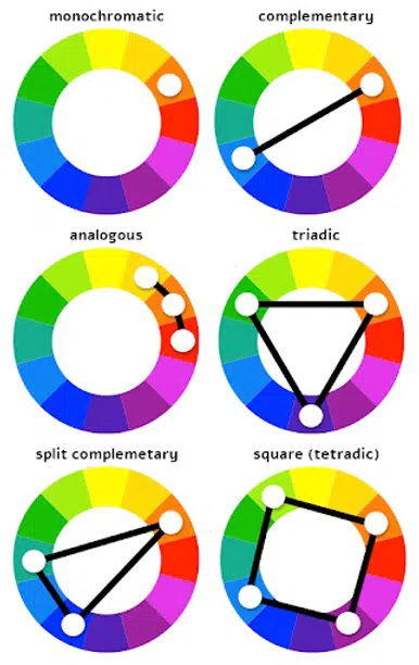
Monochromatic: mono stands for single and chromatic stands for color. Hence, it holds the range of values of a specific single color.
Complementary color: it is based on a color wheel, a color directs the opposite color of the wheel. They provide strong contrast. It helps to compose the object as the main in the composition.
Analogous color: It represents the combination of colors that are residing with each other on the color wheel.
Triadic color: It reflects the evenly spaced colors on the color wheel. It produces the emotion of harmony in the composition of a photograph. Hence, in composition, no subject or object cannot be hierarchically most important or ignored.
The individual colors as well as the combination of colors represents complex harmonies. In the real world, we have endless colors. The above combinations may create a more dramatic effect in photography composition. The final touch might be given through a post-processing system to include the perfect emotions in a photograph.
Note: The Adobe color wheel gives you the perfect explanation of the above classification.
You might like to read the other articles on photography elements like line, shape, texture.
Acknowledgement: various photography websites and pexels


Lovely
It is a fine analysis on texture in photographic view. thanks.
very much informative.