Instagram color styles photography focuses on using carefully curated tones and color grading techniques to enhance visual impact on the platform. With millions of images competing for attention, optimized color styles help photographs stand out instantly in the Instagram feed.
Whether it’s bold, high-contrast edits or soft, muted palettes, the right color approach creates a consistent aesthetic, strengthens visual storytelling, and improves engagement. By aligning color choices with Instagram’s display and compression behavior, photographers can produce images that look polished, professional, and scroll-stopping.
Instagram-optimized color styles for photography
These styles are designed to stop scrolling, boost saves and increase engagement on Instagram feeds and Reels.
1. Warm Storytelling Style (Most Engaging)
Best for: Portraits, weddings, travel, lifestyle
Mood: Emotional, cozy, cinematic
Color feel
- Warm highlights
- Soft shadows
- Natural skin tones

Suggested colors
- Warm beige:
#E6D3B1 - Soft orange:
#D98E5A - Olive green:
#6F7F5A
Editing tips
- Increase temperature slightly
- Lower contrast a bit
- Add soft grain
👉 This style works extremely well for Instagram saves and shares.
2. Bold Contrast Pop (Scroll-Stopper)
Best for: Street photography, fashion, reels covers
Mood: Energetic, powerful, eye-catching
Color feel
- Strong subject colors
- Clean backgrounds
- High contrast

Suggested colors
- Bold red:
#D62828 - Bright yellow:
#FFD60A - Deep blue:
#003566
Editing tips
- Boost vibrance, not saturation
- Darken background slightly
- Sharpen subject only
👉 Perfect for Reels thumbnails and explore page.
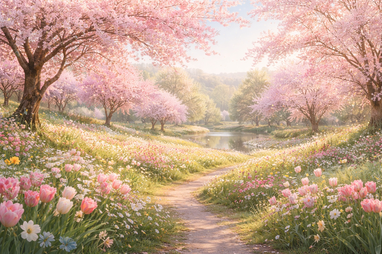
3. Soft Pastel Aesthetic (Save-Worthy)
Best for: Fashion, beauty, flat-lays, spring photos
Mood: Calm, dreamy, modern
Color feel
- Muted colors
- Bright whites
- Gentle tones
Suggested colors
- Pastel pink:
#F2C6C2 - Lavender:
#CDB4DB - Baby blue:
#BDE0FE
Editing tips
- Reduce saturation
- Lift shadows
- Slightly fade blacks
👉 This style gets high saves, especially from aesthetic-focused accounts.
4. Dark & Moody Cinematic
Best for: Artistic portraits, street, night photography
Mood: Dramatic, emotional, premium
Color feel
- Deep shadows
- Muted highlights
- Rich blacks
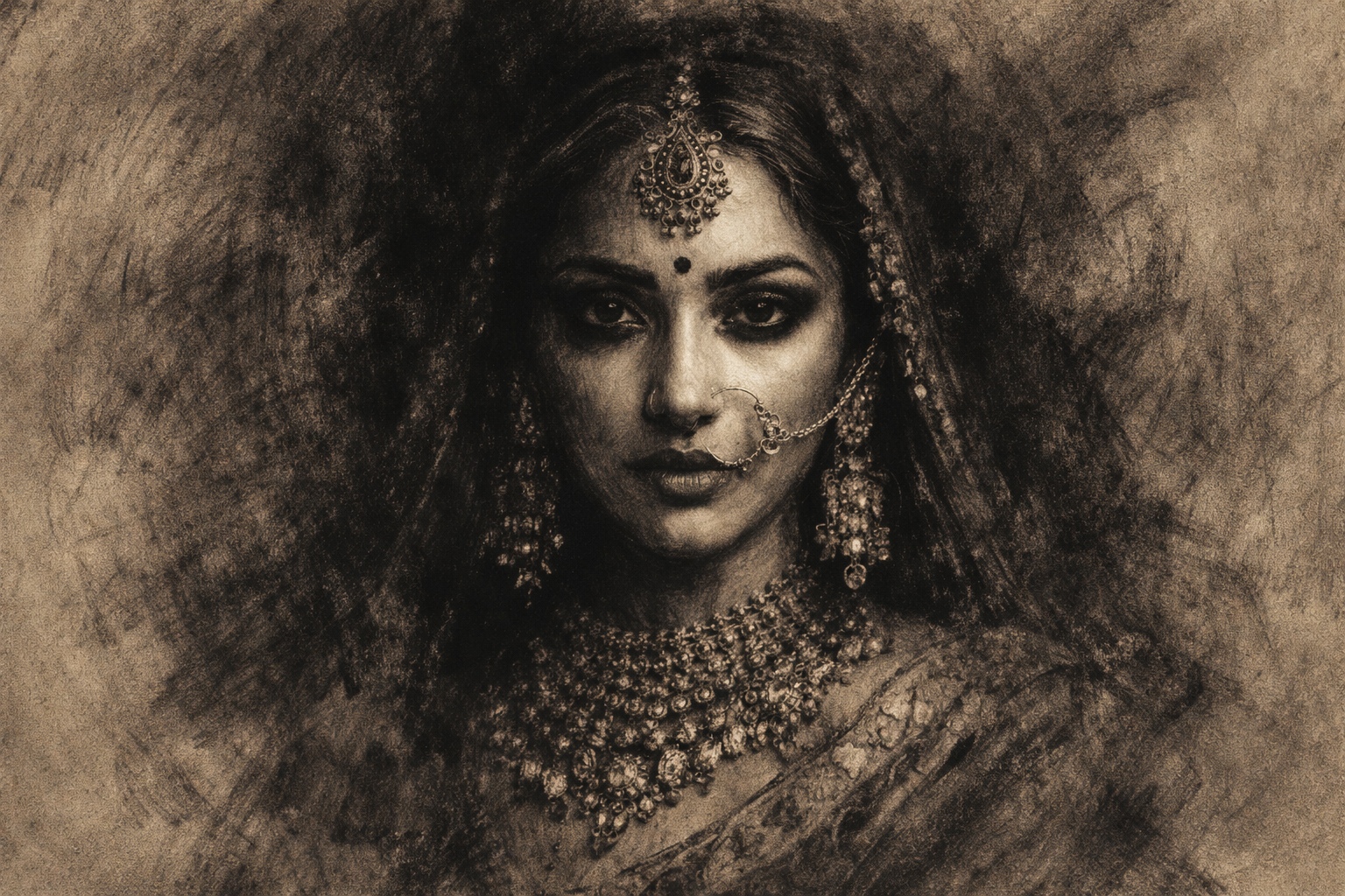
Suggested colors
- Charcoal:
#1C1C1C - Dark green:
#2D3A3A - Brown tones:
#4A3F35
Editing tips
- Lower exposure slightly
- Reduce highlights
- Add vignette
👉 Viewers spend more time looking at these images.
5. Clean Blue Professional Look
Best for: Brands, product photography, portraits
Mood: Trustworthy, minimal, clean
Color feel
- Cool tones
- Balanced whites
- Neutral contrast
Suggested colors
- Sky blue:
#8ECAE6 - Navy blue:
#023047 - Soft grey:
#E5E5E5
Editing tips
- Cool temperature slightly
- Keep whites clean
- Avoid heavy shadows
👉 Ideal for business and creator profiles.
6. Golden Hour Glow (Instagram Favorite)
Best for: Outdoor portraits, couples, travel
Mood: Romantic, magical, natural
Color feel
- Golden highlights
- Soft contrast
- Warm skin tones
Suggested colors
- Golden yellow:
#FFB703 - Soft peach:
#F4A261 - Warm brown:
#9C6644
Editing tips
- Increase warmth
- Reduce clarity slightly
- Boost highlights gently
👉 One of the highest engagement styles on Instagram.
7. Minimal Neutral Feed (Brand Growth)
Best for: Consistent feeds, personal brands
Mood: Clean, premium, timeless
Color feel
- Neutral tones
- Consistent palette
- No harsh colors
Suggested colors
- Off-white:
#FAF9F6 - Taupe:
#B8A99A - Soft grey:
#D6D6D6
Editing tips
- Keep tones consistent
- Avoid strong color shifts
- Match every photo to the same palette
👉 Builds a recognizable Instagram identity.
Pro Instagram Color Tips (Very Important)
- Edit for mobile screens, not laptops
- Avoid over-saturation (Instagram compresses colors)
- Keep skin tones natural
- Use the same color mood across your grid
- Test styles on Reels covers and profile grid
Final Advice
Instagram rewards emotion and consistency.
Color is the fastest way to create both.
Choose one main color style, master it, and stick to it. When people recognize your colors without seeing your name—that’s when your photography brand truly grows.
Frequently Asked Questions (FAQs)
1. What are Instagram color styles in photography?
Instagram color styles in photography refer to carefully curated color tones and color grading techniques designed to enhance visual impact and performance on the Instagram platform.
2. Why are color styles important for Instagram photography?
Color styles are important because millions of images compete for attention on Instagram. Optimized color styles help photos stand out instantly, making users stop scrolling and engage with the content.
3. How do color styles affect engagement on Instagram?
Strong Instagram color styles improve likes, saves, shares, and profile visits by creating visually appealing and emotionally engaging images that hold attention longer.
4. What are the best color styles for Instagram photography?
Popular Instagram color styles include bold high-contrast edits, warm tones, cinematic looks, pastel palettes, and soft muted colors, depending on the brand or personal aesthetic.
5. Should Instagram photographers maintain a consistent color aesthetic?
Yes, maintaining a consistent Instagram color aesthetic helps build brand identity, strengthens visual storytelling, and makes a profile look professional and cohesive.
6. How does Instagram compression affect photo colors?
Instagram compresses images, which can reduce sharpness and color depth. Optimizing color grading for Instagram compression ensures photos remain vibrant, clean, and professional after upload.
7. Can color grading improve professional look on Instagram?
Yes, proper Instagram color grading techniques make photos look more polished and professional, helping photographers stand out and attract followers or clients.
8. Are muted or bold colors better for Instagram?
Both can work. Bold colors grab instant attention, while muted palettes create a calm, refined aesthetic. The best choice depends on your storytelling style and target audience.
9. How can beginners choose the right Instagram color style?
Beginners should experiment with editing presets, lighting conditions, and color tones while focusing on consistency rather than perfection.
10. Do Instagram color styles help with visual storytelling?
Yes, color styles play a key role in visual storytelling on Instagram by setting mood, guiding emotions, and creating a memorable viewing experience.


Very beautiful and informative.