Color is a fundamental element of visual communication and expression. In the realm of photography, colors play a crucial role in capturing attention, conveying mood, and telling stories. From vibrant and energetic hues to subtle and muted tones, the careful and intentional use of color can transform an image from mere documentation to a captivating visual symphony. In this article, we will explore the significance of color in photography and how it can elevate your images to new heights.
Colors have the extraordinary ability to evoke emotions, set the mood, and create visual impact. Each color carries its own symbolic meaning and cultural associations, influencing how we perceive and interpret images. By understanding the psychology and symbolism of colors, photographers can strategically harness their power to enhance the narrative and resonance of their photographs. Let’s delve into the emotions and symbolism associated with some key colors:

Red color
It is the color of passion, power, and energy, red demands attention and stimulates strong emotions. It can evoke feelings of love, intensity, and urgency. Red can be used as a focal point or a visual anchor in an image, instantly drawing the viewer’s eye and adding a dynamic element to the composition.

Blue color
Blue is the color of tranquility, serenity, and spirituality. It has a calming effect on the viewer and is often associated with depth, stability, and introspection. Blue can be used to create a sense of vastness and expansiveness in landscapes or to convey a feeling of peace and solitude in portraits.

Green color
Symbolizing growth, harmony, and renewal, green is strongly associated with nature and the environment. It can create a sense of freshness, vitality, and balance. Green is often used in landscape and nature photography to depict lush forests, vibrant foliage, and serene natural settings.

Yellow color
Yellow is the color of brightness, warmth, and joy. It symbolizes optimism, happiness, and energy. It can instantly uplift the mood of an image and evoke a sense of positivity. Yellow is often used to capture the vibrant beauty of sunsets, sunflowers, or cheerful street scenes.

Orange color
Combining the vibrancy of red and the warmth of yellow, orange is a color that exudes enthusiasm, creativity, and vitality. It can add a burst of energy to an image and create a sense of warmth and excitement. Orange is often used in various genres, such as sports photography or urban settings, to add dynamism and intensity.

Purple color
As a color associated with royalty, luxury, and spirituality, purple carries a sense of elegance and mystery. It can evoke a mood of sophistication, creativity, or contemplation. Purple is often used in fashion photography, artistic compositions, or portraits to add a touch of intrigue and elegance.

Black and White
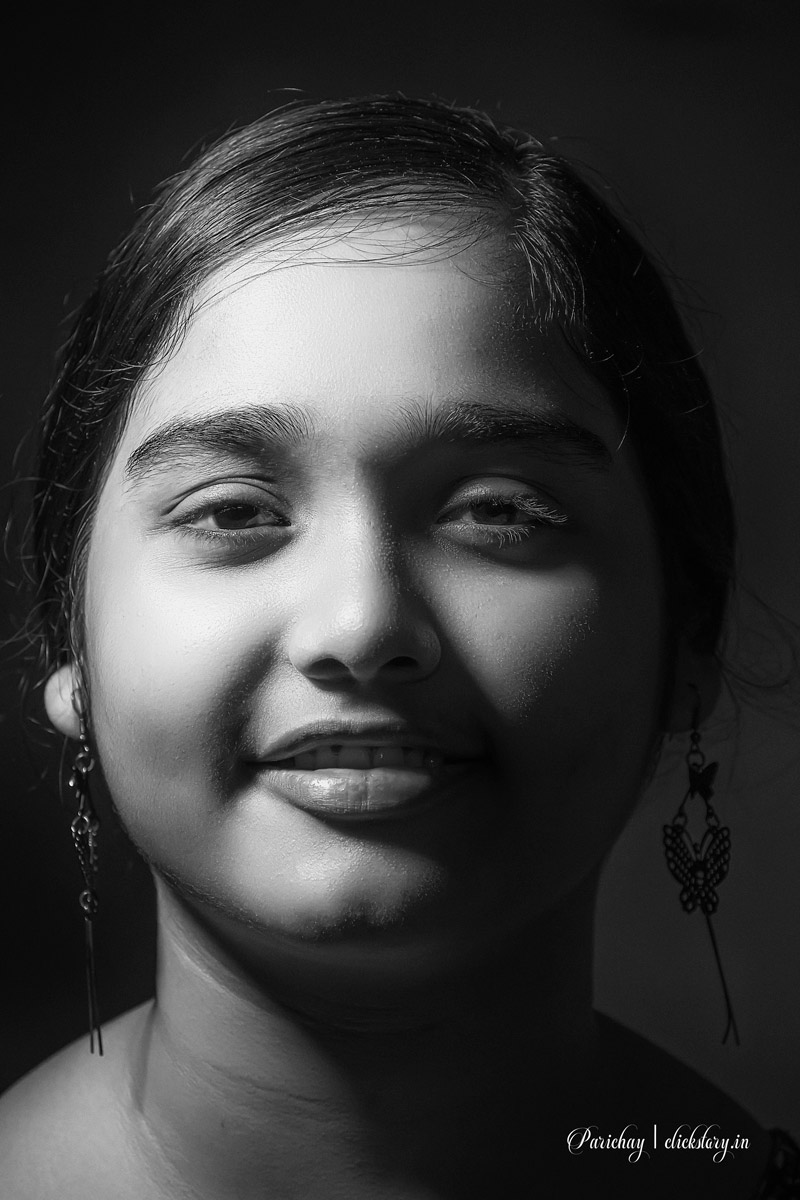
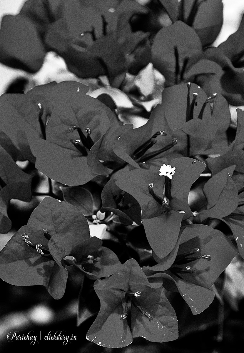
While technically not colors, black and white are powerful tools in photography. Black represents mystery, power, and drama, while white symbolizes purity, simplicity, and clarity. Black and white photography eliminates the distractions of color, allowing the viewer to focus on form, texture, and contrast, creating timeless and evocative images.
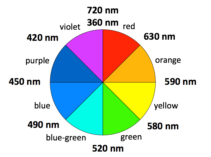
Colors harmonies and relationships

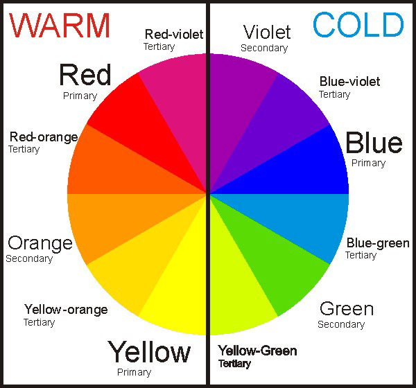
Understanding color harmonies and relationships is crucial in creating visually compelling compositions. Complementary colors, such as red and green or blue and orange, create strong contrast and visual impact. Analogous colors, such as shades of blue and green, create a harmonious and cohesive feel. Experimenting with different color schemes can help photographers achieve the desired mood and visual balance in their images.
Post processing
Post-processing also plays a vital role in the manipulation and enhancement of color. Software tools allow photographers to adjust the saturation, contrast, and balance of colors, enabling them to create a specific atmosphere and visual style. From vibrant and saturated tones to desaturated and muted palettes, post-processing provides creative freedom to shape the color narrative of a photograph.

[mc4wp_form id=”20969″]
Color contrast
Color contrast is a fundamental concept in photography that involves the juxtaposition of different colors to create visual interest, depth, and impact. By understanding and utilizing color contrast effectively, photographers can elevate their compositions and draw attention to specific elements within an image. Let’s explore different types of color contrast and how they can be applied in photography.
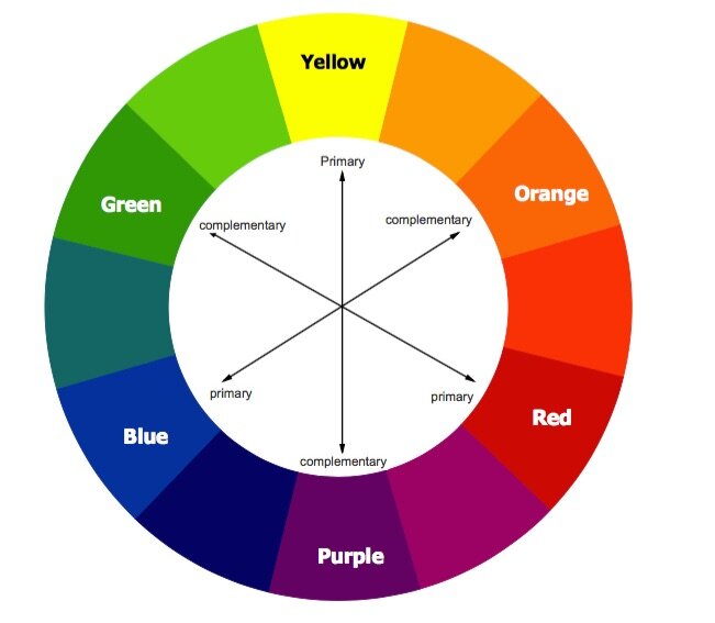
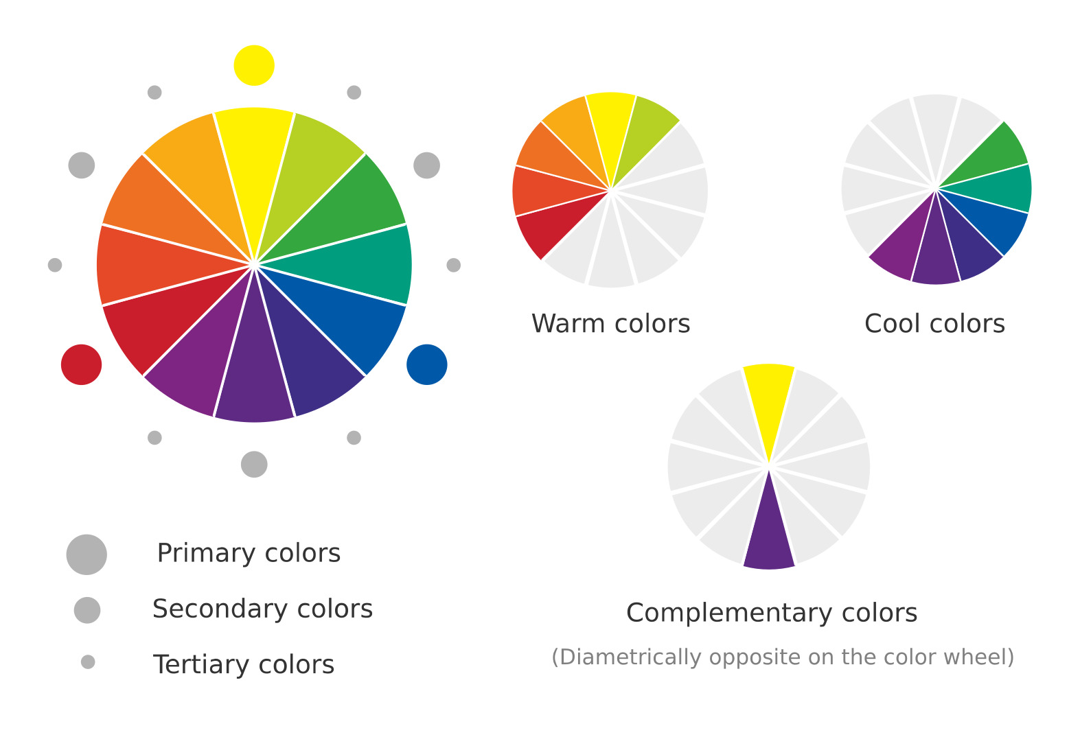
- Complementary Contrast: Complementary contrast refers to the use of colors that are directly opposite each other on the color wheel. This type of contrast creates maximum visual impact and draws immediate attention. Complementary colors intensify each other when placed side by side, creating a vibrant and energetic composition. Examples of complementary pairs include red and green, blue and orange, or yellow and purple. You can use complementary contrast to create bold and dynamic images.
- Simultaneous Contrast: when simultaneous contrast occurs, the presence of another color affects the perception of one color. When placed two contrasting colors adjacent to each other, they create an optical illusion, making each color appear more vibrant or intense. For example, a gray object can appear warmer or cooler depending on the colors surrounding it. By understanding simultaneous contrast, photographers can use it to enhance the perceived intensity and richness of colors within their images.
- Saturation Contrast: Saturation refers to the intensity or purity of a color. When photographers place highly saturated colors next to desaturated or neutral colors then it is known as saturation contrast. This contrast can create a striking visual effect, as the vibrant colors stand out against the more subdued tones. The viewer’s attention may attract on the saturation contrast to specific areas or elements within the frame.
Understanding and utilizing color contrast in photography allows photographers to create visually engaging and compelling compositions. By consciously selecting and combining colors with contrasting properties, photographers can guide the viewer’s eye, add depth and dimension, and convey specific moods or emotions within their images. Experimenting with different types of color contrast can unlock a whole new level of creativity and visual storytelling in photography.
Conclusion
color is an essential element of visual storytelling in photography. By harnessing its power, photographers can transport viewers to new worlds, evoke emotions, and create lasting impressions. Whether used boldly or subtly, color has the ability to elevate an image beyond the realm of documentation into a realm of artistry and imagination. So, embrace the vivid palette and let color breathe life into your photographic endeavors.


