Photography Color Trends That Boost Engagement
Photography color trends are more than just visual choices—they are powerful storytelling tools. Before viewers notice composition or sharpness, they feel the colors in an image. The right color tones can instantly stop scrolling, trigger emotions, and make people spend more time connecting with your photograph. When used thoughtfully, trending colors don’t just make photos look good—they make them memorable.
Whether you are a photographer, blogger, or content creator, understanding color trends can help your photos get more likes, shares, saves, and clicks.

Why Color Is So Powerful in Photography
A photo speaks without words—and color is its voice.
- Warm colors feel emotional
- Cool colors feel calm
- Bold colors demand attention
For example:

- A golden-hour portrait feels more emotional than a flat daylight shot
- A dark, moody photo feels dramatic and artistic
- A bright, colorful street photo feels energetic and alive
People connect with photos that make them feel something.
1. Warm & Earthy Tones in Photography
Warm tones are one of the biggest trends in modern photography.
Common tones:
Brown, beige, tan, soft orange, olive green
Why they work
These colors feel natural, timeless, and human. They create emotional warmth and nostalgia.
Photography examples
- Portrait photography with warm skin tones
- Wedding photos edited with soft golden highlights
- Travel photography using sunset and desert tones
Warm tones make photos feel personal and story-driven—perfect for engagement.
2. Bold Colors for Scroll-Stopping Shots
Bold colors instantly catch the eye, especially on social media.

Popular colors:
Red, bright yellow, strong blue, neon accents
Why they work
Our eyes are naturally drawn to bright colors, especially against neutral backgrounds.

Photography examples
- A red umbrella in a grey rainy street
- A yellow dress in a green field
- A blue wall portrait with high contrast
These photos stand out in Instagram feeds and thumbnails.
3. Soft Pastel Edits for Calm Aesthetics
Pastel tones are very popular in lifestyle and creative photography.
Common pastel tones:
Soft pink, lavender, baby blue, mint green

Why they work
Pastels feel light, dreamy, and peaceful. They don’t overwhelm the viewer.
Photography examples
- Fashion photography with pastel outfits
- Flat-lay photos with soft backgrounds
- Spring portraits with gentle color grading
These tones create a clean and modern look that people love to save and share.
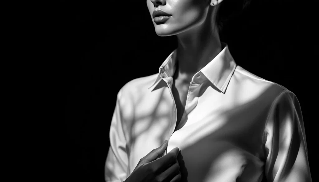
4. Dark & Moody Photography Styles
Dark and moody photography never goes out of style.
Popular tones:
Black, dark brown, deep green, navy blue
Why they work
Dark tones add drama, mystery, and emotion. They guide focus to the subject.
Photography examples
- Low-light portraits with soft shadows
- Street photography at night
- Cinematic edits with deep blacks
This style feels artistic and premium, which increases time spent viewing the image.
5. Blue Tones for Clean & Professional Photos
Blue is widely used in commercial and editorial photography.

Why it works
Blue feels calm, trustworthy, and professional.
Photography examples
- Corporate portraits with blue backgrounds
- Product photography using cool tones
- Landscape shots with blue skies and water
Blue tones make photos feel balanced and reliable.
6. Color Gradients in Creative Photography
Gradients are becoming popular in creative and conceptual photography.
Why they work
They add depth, movement, and visual interest.

Photography examples
- Sky photography during sunrise or sunset
- Studio portraits with gradient backdrops
- Abstract photography using colored lights
Gradients keep the eye moving through the photo.
7. High Contrast for Strong Visual Impact
Contrast is essential for engagement.
Why it works
High contrast makes subjects stand out clearly and improves visual clarity.
Photography examples
- Black-and-white photography
- Bright subject against a dark background
- Light subject against deep shadows
High contrast photos are easier to understand and more striking.
Simple Color Tips for Photographers
- Stick to one main color mood per photo
- Avoid over-editing saturation
- Match color tones to the story
- Keep skin tones natural
- Stay consistent with your editing style
Consistency builds a recognizable photography brand.
Final Thoughts
Great photography is not only about the camera or lens—it’s about color emotion.
The right color choices:
- Stop scrolling
- Create mood
- Tell stories
- Increase engagement
Experiment with warm tones, bold contrasts, soft pastels, or dark moods. Let color guide your viewer’s emotions—and your photography will speak louder.
Frequently Asked Questions (FAQs)
1. What are photography color trends?
Photography color trends refer to popular color tones, palettes, and styles that are widely used to enhance visual storytelling and emotional impact in photographs.
2. Why are color trends important in photography?
Color trends are important because viewers feel colors before noticing composition or sharpness. The right color tones can immediately attract attention and influence how a photograph is emotionally received.
3. How do color tones affect emotions in photography?
Different color tones trigger different emotions. Warm tones create feelings of comfort and energy, while cool tonesconvey calmness and mood, making color a powerful emotional tool in photography.
5. Do trending colors make photos more memorable?
When used thoughtfully, trending colors don’t just enhance aesthetics — they make photographs more memorable and emotionally engaging, helping them stand out in crowded feeds.
6. Should photographers follow color trends or create their own style?
Photographers should understand current color trends but apply them in a way that supports their personal style and storytelling, rather than following trends blindly.
7. How can beginners use color trends in photography?
Beginners can use color trends by adjusting white balance, color grading, and editing presets while focusing on emotional impact rather than technical perfection.
8. Are photography color trends more important than sharpness?
While sharpness matters, colors often make the first emotional connection. Strong color choices can engage viewers even before they notice technical details.
9. Where are photography color trends most effective?
Photography color trends are especially effective on Instagram, Pinterest, websites, and portfolios, where visual storytelling and emotional appeal drive user attention.
10. How do color trends support visual storytelling in photography?
Color trends help photographers guide viewer emotions, set mood, and strengthen storytelling, turning ordinary images into powerful visual narratives.


Very beautiful.