Color is a vital aspect of photography, influencing composition, emotion, and viewer perception. Understanding the color wheel and various color schemes can significantly enhance your photographic practice. This article explains the components of the color wheel, including primary, secondary, tertiary, and quaternary colors, as well as explore different color schemes such as complementary, analogous, triadic, and monochromatic. Practical examples and assignments will help you apply these concepts in your photography.
The Color Wheel
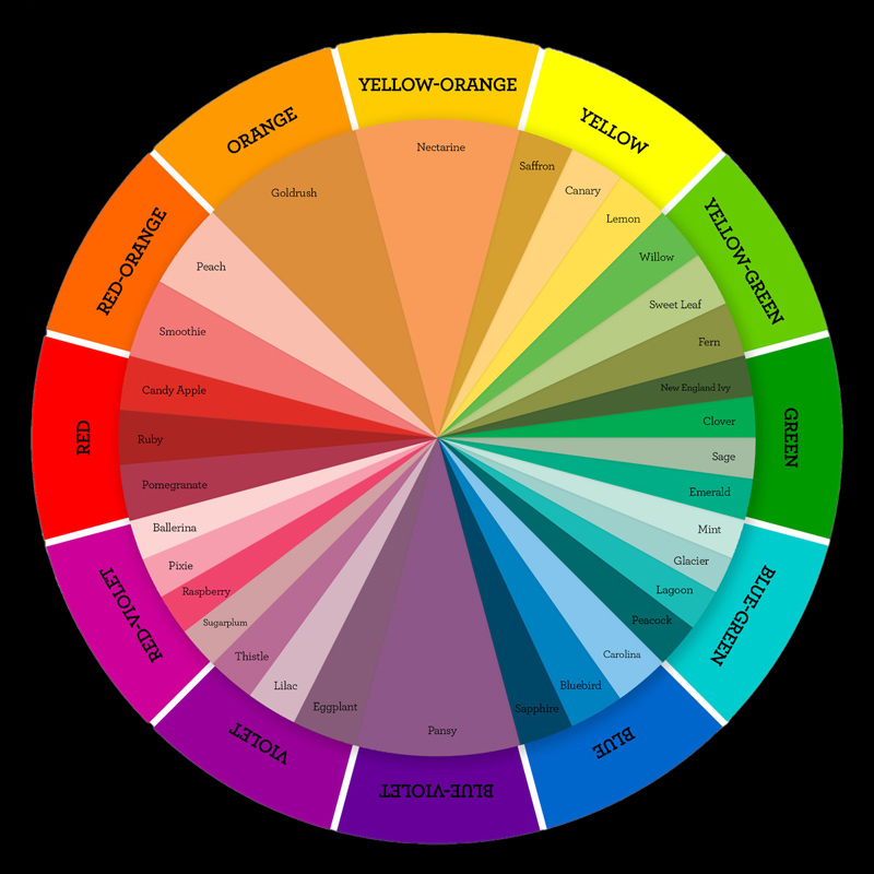
The color wheel is a circular diagram that organizes colors based on their relationships. It consists of primary, secondary, tertiary, and quaternary colors:
Primary Colors: The foundation of all color mixing. In traditional color theory, the primary colors are:
- Red
- Blue
- Yellow
Secondary Colors: These colors are created by mixing two primary colors:
- Green (Blue + Yellow)
- Orange (Red + Yellow)
- Purple (Red + Blue)
Tertiary Colors: Formed by mixing a primary color with a secondary color:
- Red-Orange
- Yellow-Orange
- Yellow-Green
- Blue-Green
- Blue-Purple
- Red-Purple
Quaternary Colors: These colors result from mixing two tertiary colors:
- Red-Red Orange
- Yellow-Green-Blue.
Color Schemes
Understanding color schemes is crucial for creating compelling photographic compositions. Here are four essential color schemes:
1. Complementary Colors
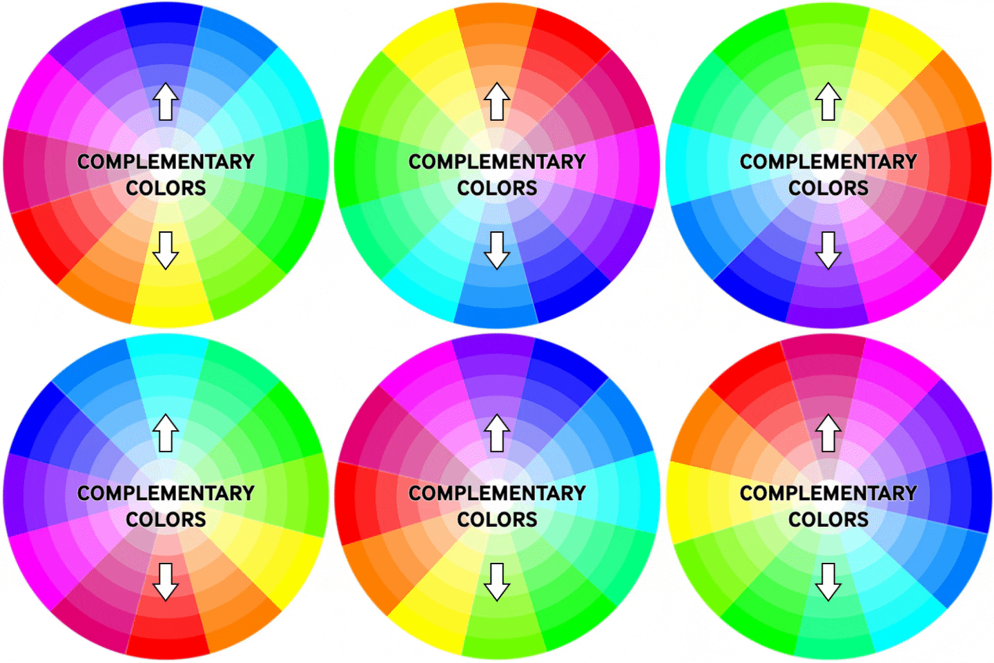
Complementary colors are opposite each other on the color wheel. When placed next to each other, they create a striking contrast.
Examples in Photography:
- A vibrant red flower against a green background.
- A model wearing a blue dress in front of an orange sunset.
Assignment:
- Find a location with strong complementary colors. Take at least three photographs that highlight the contrast between these colors. Focus on how the combination affects the overall mood of the image.
2. Analogous Colors
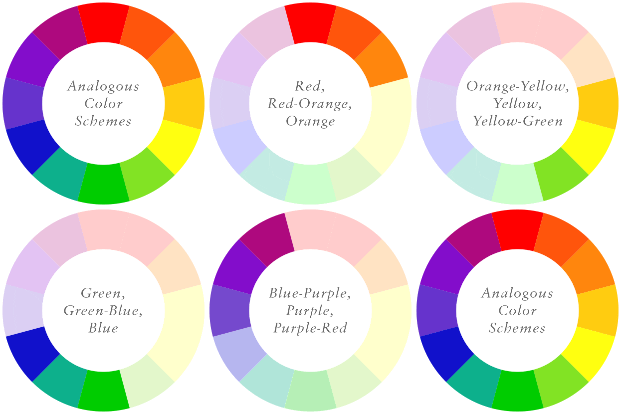
Analogous colors are located next to each other on the color wheel. They create a harmonious and cohesive look.
Examples in Photography:
- A landscape where the colors shift from yellow to orange to red during sunset.
- A floral arrangement with colors ranging from yellow to yellow-green.
Assignment:
- Choose a subject with analogous colors. Capture a series of three to five images that showcase the color transitions. Experiment with different angles and lighting conditions to emphasize the harmony.
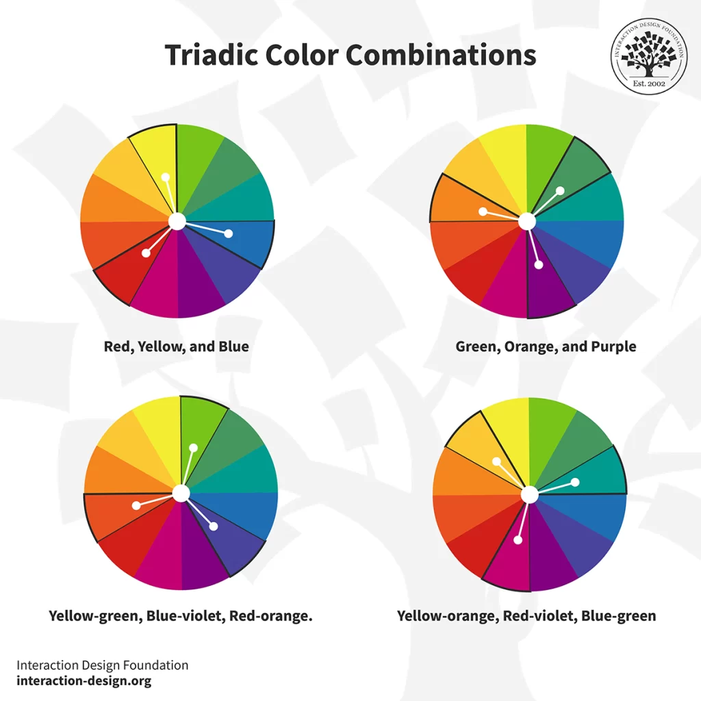
3. Triadic Colors
A triadic color scheme involves three colors that are evenly spaced around the color wheel. This scheme provides a balanced yet dynamic contrast.
Examples in Photography:
- A cityscape where blue buildings are contrasted with yellow streetlights and red signs.
- A food photograph featuring a plate with red tomatoes, yellow peppers, and green basil.
Assignment:
- Identify a scene that features triadic colors. Capture three images that incorporate all three colors, ensuring they are well-balanced in your composition. Use different focal lengths to see how the colors interact.
4. Monochromatic Colors
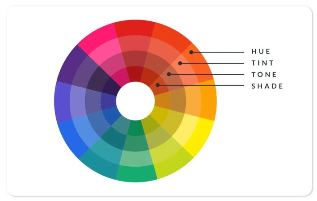
A monochromatic color scheme uses variations in lightness and saturation of a single color. This approach can create a strong visual impact and unity.
Examples in Photography:
- A black-and-white portrait that highlights shades of gray.
- A landscape captured during twilight that focuses on various shades of blue.
Assignment:
- Choose a single color and create a series of images that explore its different shades and tones. Aim for at least five images, experimenting with light, shadow, and texture to add depth.
Practical Examples
Understanding how to apply these concepts in your photography can significantly enhance your artistic vision:
- Color Harmony in Portraits: Use analogous colors in clothing and backgrounds to create a cohesive look in portraits.
- Dynamic Landscapes: Look for complementary colors in nature, such as flowers and foliage, to add vibrancy to your landscape photography.
- Food Photography: Use triadic colors to create visually appealing food photographs, drawing the viewer’s eye with a balanced palette.
Conclusion
Mastering the color wheel and understanding various color schemes are essential skills for photographers. By applying these principles in your work, you can enhance your compositions, evoke specific emotions, and create striking visual narratives. The assignments provided offer practical ways to experiment with color in photography, helping you develop a deeper understanding of how to utilize color effectively. Embrace these concepts, and watch your photography transform into a more vibrant and expressive art form!


