Color accuracy is one of the most overlooked yet decisive factors in photography. While composition and editing get the most attention, the color space you choose often decides whether your final image looks vibrant or dull, both on-screen and in print.
The challenge? Digital viewing and printing use fundamentally different systems. Screens use additive RGB light, while printers use subtractive CMYK inks. To bridge this gap, photographers must understand color spaces, ICC profiles, and calibration.
Color Space
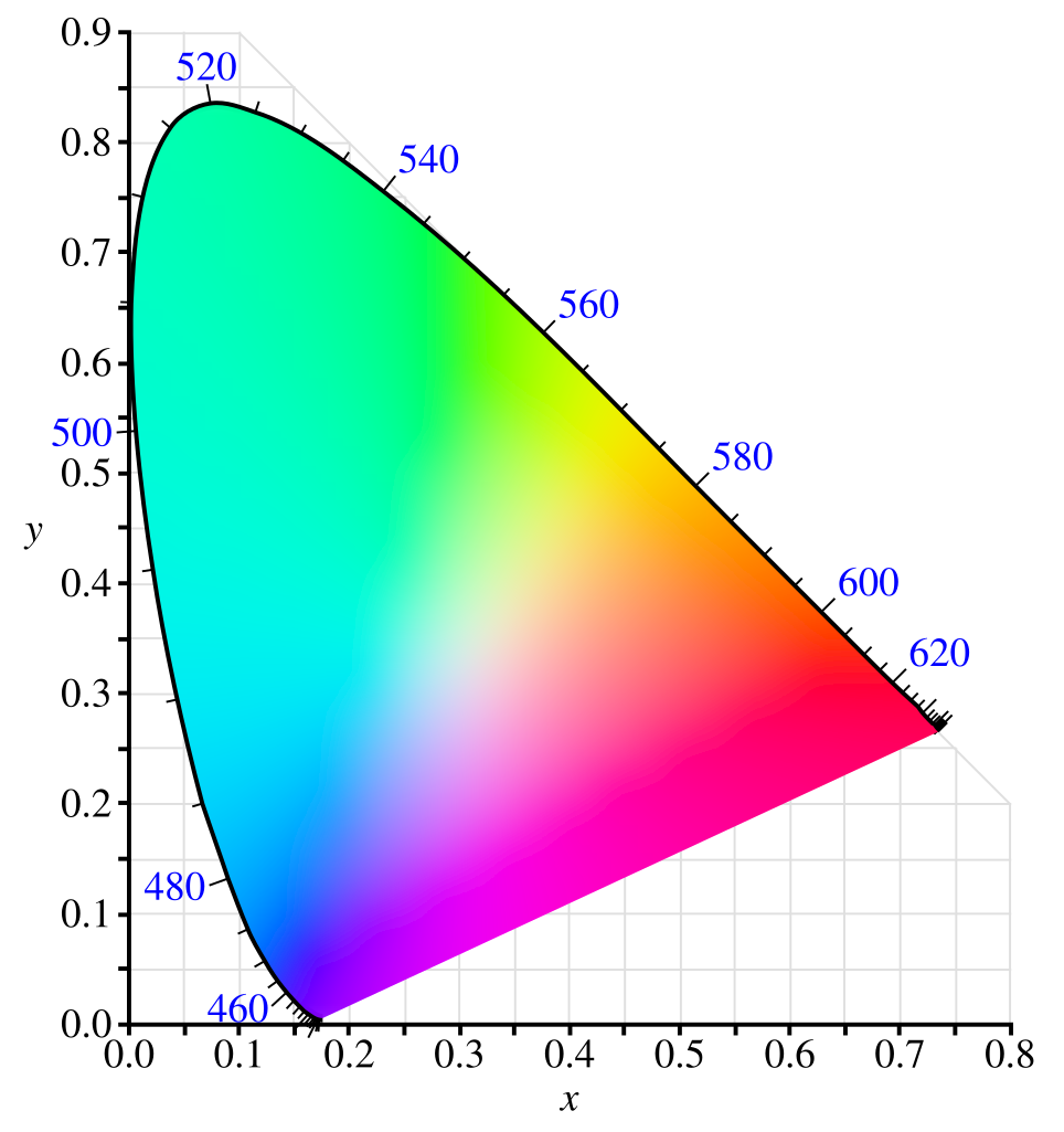
In photography, a color space is a defined range (or “gamut”) of colors that can be represented in an image file or displayed/printed by a device. Think of it as a map of possible colors: it sets the boundaries of what colors are included and how they are mathematically described.
Key Points:
- Definition
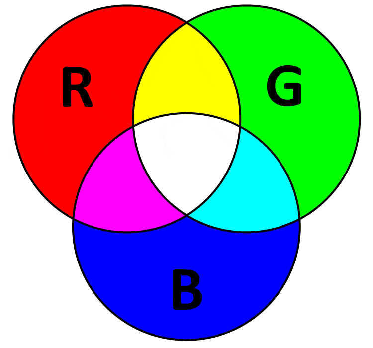
A color space is a mathematical model that organizes and defines colors using numeric values (typically in RGB—red, green, blue—or CMYK—cyan, magenta, yellow, black).- Example: An image pixel in sRGB might be described as (R=220, G=30, B=50).
- Purpose
- Ensures consistent communication of colors across devices (camera → monitor → printer).
- Prevents misinterpretation of color data when moving between different hardware/software.
sRGB: The Global Standard
Definition:
sRGB (Standard RGB), developed by HP and Microsoft in 1996, was designed to match the average CRT monitor of that era.
Utility & Use Cases:
- Universal standard for the web, mobile devices, and consumer-grade monitors.
- Used by most online platforms (Instagram, Facebook, browsers).
Advantages:
- Universally supported across platforms.
- Avoids desaturation or mismatched colors online.
- Smaller gamut reduces risk of banding in gradients.
Disadvantages:
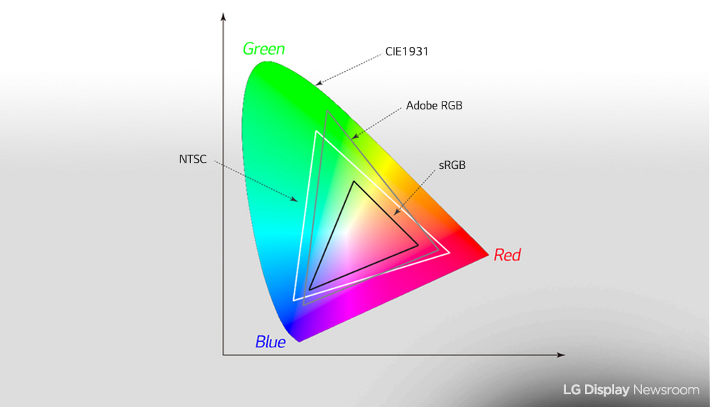
- Narrow gamut (~35% of visible colors in CIE 1931).
- Fails to represent vibrant greens and cyans.
- Not suitable for professional printing.
Measurement:
Covers ~830k colors. Significant clipping in greens and cyans when compared to AdobeRGB.
AdobeRGB (1998): The Printing Workhorse
Definition:
Created by Adobe to align better with CMYK printing, AdobeRGB expands on sRGB’s limitations, particularly in greens and blues.
Utility & Use Cases:
- Standard for professional printing workflows.
- Supported by wide-gamut monitors and many photo labs.
Advantages:
- Covers ~50% of visible spectrum.
- Matches many inkjet printers’ range.
- Provides more editing headroom for tonal adjustments.
Disadvantages:
- Not all devices support it. Images may look flat on non-managed software.
- Requires precise ICC workflows.
Measurement:
~1.2 million colors. ~35% wider gamut than sRGB, particularly in greens/cyans.
ProPhoto RGB: Maximum Flexibility
Definition:
Developed by Kodak, ProPhoto RGB is one of the largest color spaces available, encompassing over 90% of visible colors.
Utility & Use Cases:
- High-end post-production, RAW editing, archival workflows.
- Best for 16-bit editing in Lightroom or Photoshop.
Advantages:
- Retains nearly all color captured by modern cameras.
- Prevents clipping during aggressive editing.
- Future-proof for HDR and advanced workflows.
Disadvantages:
- Far beyond monitor and printer capabilities.
- 8-bit editing risks severe banding.
- Demands strict ICC color management.
Measurement:
Exceeds 2.5 million colors—far beyond AdobeRGB and sRGB.

Digital vs. Print: Why Colors Don’t Match
- Screens (RGB, additive light): Even the best monitors (Eizo, BenQ, NEC) only cover ~99% AdobeRGB, not ProPhoto.
- Printers (CMYK, subtractive ink): Ink, paper, and ICC profiles limit output. Some printers exceed AdobeRGB in reds/oranges but fall short in cyans.
Example:
A ProPhoto-edited turquoise sky may look flawless on your monitor but will compress into muted blue-green tones on matte paper if not soft-proofed.
ICC Profiles, Gamut Mapping, and Calibration
- ICC Profiles: Device-specific “translation files” that align color data between cameras, monitors, and printers.
- Gamut Mapping: Converts out-of-gamut colors via rendering intents (relative vs perceptual).
- Calibration: A wide-gamut monitor calibrated to ΔE < 2 ensures that editing decisions reflect reality.
What is an ICC Profile?
An ICC profile is a data file that describes how a device (monitor, printer, scanner, etc.) or a medium (paper type, ink set) reproduces color. It acts as a translation dictionary between your image’s color values and the actual output device.
Without the correct ICC profile, you’re essentially asking the printer to “guess” how to render your colors. That usually leads to mismatches between what you see on screen and what gets printed.
Why “AdobeRGB” Alone is Not Enough
- AdobeRGB is a working color space, not a print condition.
- It defines a wide gamut suitable for editing images without clipping too much color information.
- However, it does not describe how a specific printer on a specific paper with specific inks will actually behave.
- If you export only in AdobeRGB and send that to a print shop:
- The printer’s RIP (Raster Image Processor) or driver will have to “assume” how to convert from AdobeRGB to the printer/paper combination.
- This can result in inaccurate colors — dull reds, oversaturated greens, or shadows that block up.
Printer/Paper ICC Profiles
Every professional print workflow uses device-specific ICC profiles:
- For example:
- Epson SC-P900 printer with Premium Luster Photo Paper and UltraChrome PRO inks will have its own ICC profile.
- Canon Pro-1000 with Matte Fine Art Paper will have a completely different profile.
- These profiles are created either by the printer manufacturer or custom-built using a spectrophotometer. They account for:
- Ink absorption characteristics of the paper.
- Maximum black density (dMax).
- Gamut limitations of that printer/ink/paper combo.
This ensures the soft proof (screen preview with profile applied) and the final print match closely.
Workflow in Practice
Here’s how to apply this properly:
- Edit in a wide-gamut working space (AdobeRGB or ProPhotoRGB).
- This ensures you don’t lose valuable color information while retouching.
- Soft proof with the printer/paper profile (in Photoshop, Lightroom, or other color-managed software).
- Turn on “View -> Proof Setup -> Custom” and load the ICC profile of your printer/paper.
- Enable “Simulate Paper Color” and “Black Ink” to preview how the print will really look.
- Export/Convert to the ICC profile for printing.
- In Photoshop: Convert to Profile -> Select Printer/Paper ICC Profile
- Make sure “Relative Colorimetric” or “Perceptual” rendering intent is chosen depending on the image.
- Then export as TIFF or JPEG with that profile embedded.
- Hand off to the printer.
- Now the file tells the printer exactly how to interpret your colors. No guessing.
Example to Illustrate
- Suppose you edited a sunset photo in AdobeRGB.
- The fiery oranges are outside the printable gamut of Matte Fine Art Paper.
- If you simply export in AdobeRGB → the printer driver might clip those oranges abruptly.
- If you convert/export using the printer’s ICC profile → the conversion engine compresses the out-of-gamut oranges smoothly into printable colors, preserving tonal transitions.
Quick Note
- AdobeRGB = editing space
- Printer ICC profile = output space
- For accurate print results:
- Always edit in a wide space (AdobeRGB/ProPhotoRGB).
- But before printing, convert/export to the exact printer+paper ICC profile.
- This guarantees color fidelity, soft-proofing accuracy, and consistent results.
Best Practices for Photographers
- Edit in ProPhoto RGB (16-bit): Preserve maximum flexibility.
- Soft Proof: Use your printer/paper ICC profile in Photoshop or Lightroom.
- Export for Web in sRGB: Ensures consistent display across platforms.
- Export for Print in ICC Profile: Don’t just rely on “AdobeRGB”—use the exact paper/printer profile.
- Invest in a Wide-Gamut Monitor: Aim for 99% AdobeRGB coverage for print workflows.
Why Most Photographers Overlook This
Because many photographers never print, they stay within the sRGB bubble—editing, sharing, and viewing online only. Once they enter fine-art printing or exhibitions, unmanaged color workflows often lead to frustration and disappointment.
Conclusion
Color spaces are not just technical jargon—they’re the foundation of professional photography.
- sRGB ensures universal compatibility but limits vibrancy.
- AdobeRGB offers a balanced approach for serious printing.
- ProPhoto RGB preserves maximum data but demands careful management.
Combined with ICC profiles, gamut mapping, and calibration, the right color space ensures your vision translates seamlessly from glowing screens to fine-art prints.